| Forums | Chat | News | Contact Us | Register |
PSU Social
|
 |
PSU: Not Phantasy Star Universe!
| Forums | Chat | News | Contact Us | Register |
PSU Social
|
 |
| Home | Forum | Chat | Wiki | Social | AGN | PS2 Stats |
|
|
|
||||||
 |
|
|
Thread Tools | Search this Thread | Display Modes |
|
|
|
|
[Ignore Me] #1 | ||
|
Corporal
|
While I enjoy PlanetSide's incredible graphics for its day, Looking back, I realize that I think its a bit too bubbly so to speak; Too curvy, vibrant and bright with no change in its Atmosphere.
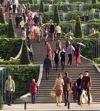
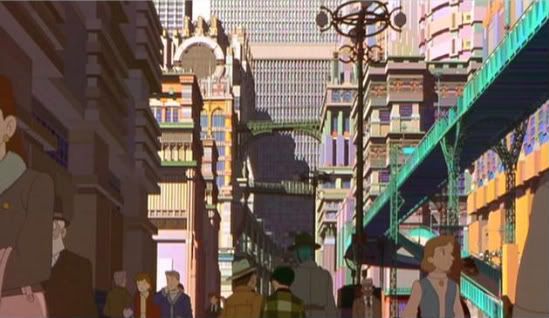
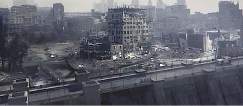
Despite the violence, it doesn't feel like there's a war going on at all, really. Each battle feels more like a friendly game of Paintball than Hardened Trained Killers out to blow each others to bits. The Stylization is incredibly clean and smooth with a Static, bright world. I'm hoping the next installment of PlanetSide will be more dark and edgy. A world that shows the faces of war and the consequences and the suffering. One that sets the mood for the game. Do we want to go in there Sipping Champagne whilst shooting flamboyantly and queerly at each other, congratulating the victor for a bloody good show? Or do we want to Fight like Our Lives Depended on it? I hope the developers of PlanetSide: Next pull references from several movies/games that have set a bar on what the future might look like and what War is like. Visually, I hope PlanetSide: Next combines several Science Fiction titles as well as other titles for stylization. Minority Report, A.I, Firefly, Mad Max, Fallout Series, Renaissance, The Derelict planet of Soldier, Mirror's Edge, Escape from NY, Aeon Flux, The Matrix, I Robot, Sin City, The Watchmen, Immortal, The Gene Generation, Death Race, Equilibrium etc... Below are some pictures that inspire me in my hope for a vibrant yet gritty world where we can wage War on each other.  http://pinktentacle.com/2008/08/toky...he-apocalypse/  http://www.designophy.com/uploadedim...spread_big.jpg For full size image  http://www.designophy.com/uploadedim.../flyby_big.jpg for full size            Ehhhh I think thats enough pictures, but I hope you get the idea. I wanted to portray the many faces of War and who it effects. I hope Planetside: Next has a deep, rich and detailed world that shows the many aspects of War. On a Side Note, has anyone else noticed that Bai Ling really looks like Faith from Mirrors Edge? =P 
Last edited by Kumoblade; 2009-11-22 at 03:29 AM. |
||
|
|
|
|
|
[Ignore Me] #2 | ||
|
Major
|
Yeah I agree I think they should probably downplay the bright colors this time around. An opt for a tad more realistic sci-fi look. But at the same time a big criticism people have had for games this gen too has been too much brown an grey. So I think we should definitely still get some jungle's an forests throw into the mix.
|
||
|
|
|
|
|
[Ignore Me] #3 | |||
|
Corporal
|
I hope to see just as many exotic locations as there are massive metropoli. Mountain Fortresses, exotic rain forests untouched by civilization etc.... If segments of PS: Next have Anything in common with the Alien world in James Cameron's Avatar, I'll probably die in ecstacy. Biolumination and deep forests, along with Dark skies and Neon lights and sprawling technology are some of my favorite things. |
|||
|
|
|
|
|
[Ignore Me] #4 | ||
|
Private
|
I would like to see the faction sanctuaries looking similar to those in the movie District 9.. Perhaps orbiting in the outer atmosphere and visible from the planets surface.

__________________
Marijuana is an essential part of the gaming experience. True story. |
||
|
|
|
|
|
[Ignore Me] #5 | ||
|
First Sergeant
|
I think as long as the environments are varied, the game will be successful. Since I was only 11 when i first played the game, the graphics were never very important to me. But now, I think that the game just needs to be different to be successful
|
||
|
|
|
|
|
[Ignore Me] #6 | ||
|
Corporal
|
Personally I kind of like to see differing environments from which each faction is based.
For example the difference between GDI's "blue zones" and NOD's "yellow zones" in the 3rd Tiberium wars. It made for an interesting geopolitical perspective between the two sides, and made it so that when you were NOD you felt like you had to get revenge against the stingy GDI, whereas when you were GDI you felt like you needed to protect the blue zones from being destroyed. I'm not quite sure how this would work for planetside, but its these subtle details that help give the game more meaning. Ex: (think of how important those cutscenes are in a campaign RTS, now think of how meaningless each mission would be without them). Anyway, just a thought. |
||
|
|
|
|
|
[Ignore Me] #7 | ||
|
Lieutenant Colonel
|
I want PS2 to be gritty, the world should be war torn for the most part and the troops should reflect that.
I also want individuals and outfits to have the ability to customise their gear to some degree, making both individuals stand out as well as outfits to have more visibility rather than just a choice of 16 logos and a name over your head. |
||
|
|
|
|
|
[Ignore Me] #8 | |||
|
Major
|
Personalization like the ear-piece, hats, helmet and eye-shades aswell as Outfit badges. Yes I agree but certainly - most certainly not extensive though. Last edited by Tikuto; 2009-12-14 at 08:24 AM. |
|||
|
|
|
|
|
[Ignore Me] #9 | ||
|
Lieutenant Colonel
|
Regardless of the empires, I wonder how capturing and holding ground for a set amount of time could be represented and used to make the game more interesting.
With the current factions, perhaps the TR capture regions and move civilians back into the area, while the NC destroy the infrastructure. VS on the other hand start converting the regions into large scale experiments, setting up equipment and performing weird tests on the inhabitants... Just rambling really, but giving us something to actually fight for and see our factions ideals played out would be interesting. |
||
|
|
|
|
|
[Ignore Me] #10 | ||
|
Corporal
|
I would like the 3 factions to have a different appeal and playstyle to them when it came to taking territory.
I want PS:Next to be beautifully colored yet have a darker theme, with no factions looking like unwrapped starbursts candy. I would like to see Vanu (or the vanu equivalent) more as a Techno/Cybercult. That would be freakin slick. I want to see their implants and such and cybernetics popping through their muscles and limbs. chips and such connected to their heads. (Almost makes me think of Dark City =P) Their vehicles and weapons could be Sleak and Aggressive looking. I like the idea of the New Conglomerate (or its equivalent) being almost Renegade/Freedom Fighter'esque, with their vehicles and weapons looking like they were built from a scrapyard but are no Less effective. They would also get to wear headbands and bandanas over their faces, because they're hardcore like that, and its awesome. Their vehicles could vary greatly between Modern and Sci-Fi with a scrapyard element to it, like Road Warriors, Return to (Whatever), Mad Max, etc... The Terran republic/equivalent could focus on a more smooth-clean look for their clearly oppressive appearance. Their vehicles would look cleanly and well manufactured and built for war. And their outfits/uniforms would look relatively futuristic with clearly Logical approach to their designs for maximum efficiency. (unless they have a crazy hitler-like dictator who was just nuts).. Perhaps each faction could also specialize in certain things. Vehicles/Implants, so on and so forth. |
||
|
|
|
|
|
[Ignore Me] #11 | ||
|
Colonel
|
I don't particularly like gritty, wartorn, black, grey, headbands, urban, yadda yadda yadda... For me, the best moments in Planetside came when the environment felt truly epic, e.g. Cyreshen bridges and snowstorms, murky Hossin swamps drenched with rain, vast and open Cyssor rivers, etc. Intense weather, and epic landscapes, and complex terrain seem more fun - and make for better stories - than yet another set of dark, cramped, urban warfare landscapes. Shouldn't the environment reflect the kind of game we want? Do we want another derivation of Gears of War, and COD, and so on? Or do we want something different?
I want bridge battles, over open water, in pouring rain, for hours. |
||
|
|
|
 |
|
|
| Bookmarks |


|
|