My VS MAX Redesign - Page 2 - PlanetSide Universe
PSU Social Facebook Twitter Twitter YouTube Steam TwitchTV
PlanetSide Universe
PSU: Because idle hands do the devil's work!
Home Forum Chat Wiki Social AGN PS2 Stats
Notices
Go Back   PlanetSide Universe > PlanetSide Discussions > PlanetSide 2 Discussion

Reply
 
Thread Tools Search this Thread Display Modes
Old 2012-07-30, 01:03 AM   [Ignore Me] #16
IHateMMOs
First Sergeant
 
IHateMMOs's Avatar
 
Misc Info
Re: My VS MAX Redesign


The thing I like about the VS max is that it's sort of predicting what the Vanu aliens looked like, they may have looked exactly like the max, and might have even had the claw arms and the shoulder wings.
IHateMMOs is offline  
Reply With Quote
Old 2012-07-30, 01:08 AM   [Ignore Me] #17
cryosin
Master Sergeant
 
cryosin's Avatar
 
Re: My VS MAX Redesign


Originally Posted by Shinjorai View Post
I like both designs and think itd be kewl if they sold max redesigns like this in the cash shop. I like your visor best too. I think that dark blue looks better than the orange. Great job on the redesign.
Ty

I agree on the cash shop. Hopefully customizations would go far enough to let you re-design your model!
cryosin is offline  
Reply With Quote
Old 2012-07-30, 01:18 AM   [Ignore Me] #18
Grognard
Contributor
Second Lieutenant
 
Grognard's Avatar
 
Re: My VS MAX Redesign


Both remind me of popeye... needs more balance in the lower/upper arm to me.
__________________

Kein Plan überlebt die erste Feindberührung. Res ad triarios venit... μολὼν λαβέ!
Grognard is offline  
Reply With Quote
Old 2012-07-30, 01:33 AM   [Ignore Me] #19
AzureWatcher
Staff Sergeant
 
AzureWatcher's Avatar
 
Re: My VS MAX Redesign


I like the original. It's much more sleek and streamlined, which is what the Vanu are all about.

Edit: Good photoshop, though!

Last edited by AzureWatcher; 2012-07-30 at 01:41 AM.
AzureWatcher is offline  
Reply With Quote
Old 2012-07-30, 01:37 AM   [Ignore Me] #20
Kran De Loy
Captain
 
Kran De Loy's Avatar
 
Re: My VS MAX Redesign


I like the original.

Leaves open more options to add cosmetics to personal taste.
Kran De Loy is offline  
Reply With Quote
Old 2012-07-30, 03:21 AM   [Ignore Me] #21
Azren
Sergeant Major
 
Re: My VS MAX Redesign


I prefere the "crab hands"
Azren is offline  
Reply With Quote
Old 2012-07-30, 04:26 AM   [Ignore Me] #22
Envenom
Sergeant Major
 
Envenom's Avatar
 
Re: My VS MAX Redesign


Excellent. Make the VS Maxes larger. The TR approves of larger targets.
Envenom is offline  
Reply With Quote
Old 2012-07-30, 07:11 AM   [Ignore Me] #23
BlueSkies
Staff Sergeant
 
BlueSkies's Avatar
 
Re: My VS MAX Redesign


Either way, it looks like a villain from the Power Rangers
__________________
BlueSkies is offline  
Reply With Quote
Old 2012-07-30, 11:58 AM   [Ignore Me] #24
Reizod
Contributor
Master Sergeant
 
Reizod's Avatar
 
Re: My VS MAX Redesign


Great photoshop editing. However, I like the original VS Max look. More streamlined which is what I like about VS.
__________________
<A true Vanu, I'm anything but primitive. What my mind doesn't know my heart fills in.>
Reizod is offline  
Reply With Quote
Old 2012-07-30, 01:07 PM   [Ignore Me] #25
ThermalReaper
First Sergeant
 
ThermalReaper's Avatar
 
Re: My VS MAX Redesign


There was this long sort of cannon weapon in the concept arts. That's a weapon I'd love to see in the game. One second till I find the concept art.

edit:
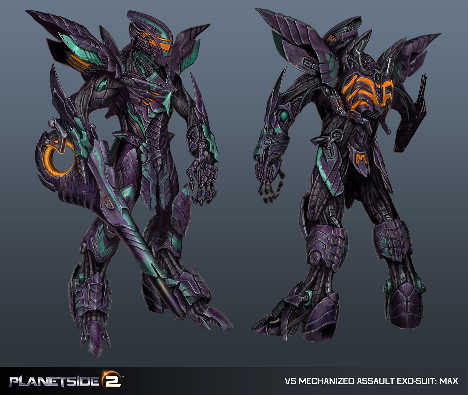
Is that awesome or what?

Last edited by ThermalReaper; 2012-07-30 at 01:09 PM.
ThermalReaper is offline  
Reply With Quote
Old 2012-07-30, 01:11 PM   [Ignore Me] #26
OutlawDr
Contributor
First Sergeant
 
OutlawDr's Avatar
 
Re: My VS MAX Redesign


The current in game vanu max we've seen in recent videos, needs less bulky looking hands, and beefier arms.
__________________
OutlawDr is offline  
Reply With Quote
Old 2012-07-30, 01:25 PM   [Ignore Me] #27
Gugabalog
Major
 
Gugabalog's Avatar
 
Re: My VS MAX Redesign


I like the redesign better 100%
Gugabalog is offline  
Reply With Quote
Old 2012-07-30, 02:13 PM   [Ignore Me] #28
SeanNewBoy
Corporal
 
Re: My VS MAX Redesign


I like parts of your new version, i would love to get costume unlocks in the store to be able to mix and match. Coming from Star Trek Online, i will probably never be fully satisfied with, costumes/visual appearance customization in PS2.
__________________
I also play STO, SWTOR, and Diablo 3.
SeanNewBoy is offline  
Reply With Quote
Old 2012-07-30, 05:43 PM   [Ignore Me] #29
cryosin
Master Sergeant
 
cryosin's Avatar
 
Re: My VS MAX Redesign


Thanks for all your feedback everyone. I hope we do get some awesome 3D model customizations
cryosin is offline  
Reply With Quote
Reply
  PlanetSide Universe > PlanetSide Discussions > PlanetSide 2 Discussion

Bookmarks

Discord

Thread Tools Search this Thread
Search this Thread:

Advanced Search
Display Modes

Posting Rules
You may not post new threads
You may not post replies
You may not post attachments
You may not edit your posts

BB code is On
Smilies are On
[IMG] code is On
HTML code is Off

Forum Jump


All times are GMT -5. The time now is 08:15 PM.

Content © 2002-2013, PlanetSide-Universe.com, All rights reserved.
PlanetSide and the SOE logo are registered trademarks of Sony Online Entertainment Inc. © 2004 Sony Online Entertainment Inc. All rights reserved.
All other trademarks or tradenames are properties of their respective owners.
Powered by vBulletin
Copyright ©2000 - 2024, Jelsoft Enterprises Ltd.