| Forums | Chat | News | Contact Us | Register |
PSU Social
|
 |
PSU: Giving credit where credit is due
| Forums | Chat | News | Contact Us | Register |
PSU Social
|
 |
| Home | Forum | Chat | Wiki | Social | AGN | PS2 Stats |
|
|
|
||||||
|
|
Thread Tools | Search this Thread |
Rating: 
|
Display Modes |
|
|
[Ignore Me] #1 | ||
|
Major
|
Now, as we all have seen the new MAX armors, I'm sure we're all ready to throw our money to SOE for early access. So, as for the videos I've seen, I noticed something missing, something very very vital for what a MAX is.
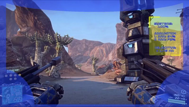
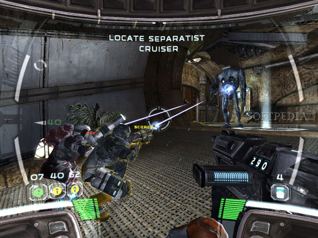
First off, I know it's alpha, but posting ideas of things not quite revealed helps to ensure they are added, especially if the devs forget to add something. In any case.... A MAX is a walking vehicular soldier. As such, they deserve A MUCH MORE DEFINED HUD THAN INFANTRY. Rather than being plain and vague, the idea is to let it seem more mechanical, giving information about the armor itself and other stuff. This can also allow for more MODs just for the HUD itself (maybe a targeting HUD, to spot enemies easier!). In any case, the MAX NEEDS a nice mechanical high tech HUD (base on empire as well), to INSPIRE any player donning that massive suit of armor. Part of the concept of immersion after all. Here is a quick concept on how a HUD would look  Semi Transparent placement of the sides to make it feel like you're looking out an enhanced helmet, to view through closed off space. Making the player feel like they are inside something strong and durable helps out with immersion and feel, and letting it be transparent prevents any reduction of visual range (though any impairment might balance the MAX a bit). Notice on the right I give a holographic information window. Maybe even having it toggle on and off with a single key would improve it's function. Now you can see your health, your ammunition supply, and objective distance with ease. But the big reason for it is it gives you the greater feeling of the MAX suit being a super powered pinnacle of infantry capability! Now, if my little visual aid doesn't give too good of an explanation, I'll use a game that has said HUD system. Look at Star Wars: Republic Commando. They use a high tech helmet HUD type outlook, and it went together PERFECTLY. You felt empowered and more capable.  If we can give this feeling to a MAX suit, it'd definitely end up being more fun! |
||
|
|
|
|
|
[Ignore Me] #2 | ||
|
Corporal
|
HUD eliments, in order to be of practical use must not permanently obscure it's visual field, that's just going to be frustrating. I like the idea of some sort of "helmet HUD" type arrangement, but it must be implimented with a view to making the MAXes fun to play, not with a view to hamstrining their FOV. You can balance weapons and whatnot through seamless ways without dropping great transparent text boxes all over the place.
I'm particularly leary of the top segment, that's a big chunk of high threat area I'm no longer seeing. 1/3 of MAX gameplay will be shooting at Aircraft, frustrating players with invasive HUD eliments when it's already challenging enough to crane your view up to squint at the tiny dots that could drop HE on your head is enough of a task. That said, I'd definately go for some unobtrusive stuff for weapon readouts. Maybe some complex overlays for weapons locks beyond the usual battlefield style red target box. |
||
|
|
|
|
|
[Ignore Me] #3 | ||
|
Major
|
Well, I suggest a transparent border, not opaque, it won't obscure your view, but it would make you concentrate on the center more, which can help you in long range fights really.
I'm thinking it'd be cool if you could bind buttons to pop up information menus, so you can get a look at stuff when you need to and put them back when you just wanna deal with killing. An anti air MAX might want to keep a menu up to see their ammo count while blasting away at aircraft. |
||
|
|
|
|
|
[Ignore Me] #4 | ||
The MAX heads aren't much different from the reinforced exosuit heads. In fact, every class has some kind of covering over their eyes, whether it's a visor or goggles. There's no reason a MAX should have a big, clunky HUD while any other infantry class wouldn't. I understand the desire for some sort of immersive element I guess, but there's a pretty serious issue regarding HUD clutter with those screens. But in a competitive FPS game, would people really appreciate all of the classes having obtrusive HUDs?
Last edited by Warborn; 2012-05-28 at 03:31 AM. |
|||
|
|
|
|
|
[Ignore Me] #5 | |||
|
Major
|
A lot isn't needed, but we have come to expect some and want others. What's wrong with making the super heavy MAX suit, which uses ARMOR instead of shielding, seem a bit more vehicular? It's the hybrid between infantry and vehicle, a few cool HUD issues would make it stand out even more. |
|||
|
|
|
|
|
[Ignore Me] #6 | |||
|
Major
|
|
|||
|
|
|
|
|
[Ignore Me] #7 | ||
|
Major
|
Yeah, and it's that sort of feeling that I think could improve the MAX suit. And as I stated, if you had information boxes that could be sort of, well, "minimized" at the press of a button, you can keep lots of information up when you need it, and remove it when entering close quarters combat.
|
||
|
|
|
|
|
[Ignore Me] #8 | |||
|
Major
|
 " look when you keep crashing into stuff and hear your muffled cursing because you can't see anything. " look when you keep crashing into stuff and hear your muffled cursing because you can't see anything.I wonder if people still do advertising while the war is going on. Could imagine being in a MAX suit then next minute getting spam mail from everyone and your suit seizes up and you keep hearing annoying noises from hundreds of pop up ads. 
|
|||
|
|
|
|
|
[Ignore Me] #9 | |||
|
Major
|
|
|||
|
|
|
|
|
| Bookmarks |
| Tags |
| hud, max |


|
|