| Forums | Chat | News | Contact Us | Register |
PSU Social
|
 |
PSU: Apply lubricant before insertion.
| Forums | Chat | News | Contact Us | Register |
PSU Social
|
 |
|
|
[Ignore Me] #136 | |||
|
Contributor Major
|
It's generally accepted that the purpose of the U.I is to provide as much information in as elegant a way as possible. The less I have to do to get what I need the better off the UI is. Not only that but the most urgent information (player health, ammo etc.) has to be the easiest to get to while things not so urgent (capture points,base status) don't need to be shown all the time. In an FPS the most urgent things will always be what you need to know when someone is shooting at you. These are the things that no clicks should be done to see. While things like the squad indicator, while relevant to know but doesn't have any impact on shooting someone or getting shot, can afford to be moved off screen. Just because something works doesn't mean it shouldn't be improved upon. Players will always say something is good enough until something better shows up and they find out how bad they had it. |
|||
|
|

|
|
|
[Ignore Me] #137 | ||
|
Colonel
|
Roguy, PS1's squad display system was infinitely more usable and informative than where it is and what it tells you now. If you played the game, you'd know what I'm talking about.
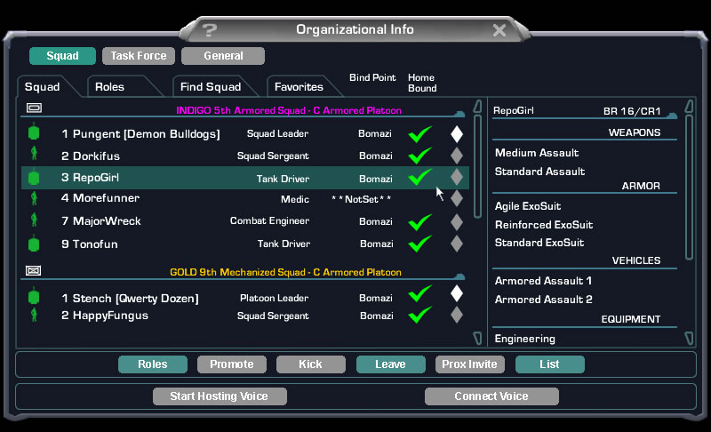
Current (PS2) Pros: -Shows roster of squadmates? (You can barely see the names) -Loadouts Cons: -Everything else Planetside 1: Pros: -Showed health/armor of squadmates -Gave you a color and number to call them by in chat or on TS for easy comms -Showed each squad member's location -Easy to read the names and numbers -Optimal design for setting up a platoon -Probably many more I'm leaving out Cons: -Can't see loadouts I think we have a winner here... |
||
|
|

|
|
|
[Ignore Me] #138 | |||
|
Sergeant
|
Although I'd argue the opposite is also quite common, for example: Bad company 2: No health indicator, pissed off pretty much everyone. http://forum.ea.com/eaforum/posts/list/376705.page Brink: INFORMATION OVERLOAD. http://imageshack.us/f/218/0498eac35df38e2d56a9d89.jpg/ Red Orchestra 2: Why does the squad selection screen sometimes disappear? Why can't I join my friend's squad as machinegunner even if there are spots open? Where the hell is he anyway, why arn't people on my friends list highlighted? |
|||
|
|

|
|
|
[Ignore Me] #139 | |||
|
Contributor General
|
|
|||
|
|

|
|
|
[Ignore Me] #140 | |||
|
Sergeant
|
A good UI is the comfy middle between being INFORMATIVE and CONCISE. For example, Eve online's UI i very informative although my opinion is that showing the tracking speed of all objects around you to the 5th decimal to be stupid, distracting and confusing. Anyway back to Planetside 1's UI.  1) It's ugly (due to age sure, but it's still hideous by today's standards). 2) What's up with the bottom bar? This isn't Doom, this takes up space for no reason. 3) A hotbar? In an FPS? When has it been necessary to know what secondary abilities, weapons and grenades you're carrying all the time? Can't you just... remember? 4) Why does it say "galaxy" above a Galaxy? Don't you think we all know that already? 5) In the middle of a firefight, i don't need or want a button to access my friendslist or even a button to access the map. If you've ever played a game before "M" usually brings the map up. This is just weird misplaced MMORPG heritage in my MMOFPS. And all that isn't even the half of it. The absolute worst part of PS1 was the kill list that scrolled so fast it made it beyond unreadable. I remember never going engineer with spitfires and mines because i never knew if i got kills with them or not. Knowing that having a shiny +100 at the top of my screen doesn't seem anywhere near as bad. Although yes, squad health+armor and location is real handy. Last edited by roguy; 2012-05-25 at 05:33 PM. |
|||
|
|

|
|
|
[Ignore Me] #141 | ||
|
Contributor Major
|
The problem with PS1's squad indicator is that it had more information but took up way more screen space.
Want to know what I would do with the UI? Kill the objectives, squad, and minimap indicators. 3D indicators Friendlies - Friendlies in squad have their names up at all times along with their health status (Green, Yellow, Orange) within a certain range. Classes have their own pertinent information visible as well with appropriate certifications. If you are a squad leader you can extend this range. Enemies - Standard 3D spotting Capture points - Same as seen now but with pie chart like dials along the circumference to show who is contesting the points. The New Map Minimap/Cont map toggle - with a mouse wheel up/ mouse wheel down players can toggle between the strategic continent map, and a 3d representation of the minimap much like the war room table from PS1. The new minimap shows height as well as squad positions with names and statuses along with spotted enemy positions. It will be orientated with the direction the player is facing. Squad indicator - the new squad indicator will be placed on the right side of the screen as a vertical table. This table indicates detailed information ranging from health, loadout, and voice control. Objectives - The new objective menu is coupled with the mission menu to provide detailed empire activity within the area and goals to accomplish. This is how I would change the U.I. I believe it to more represent the utilitarian aspect of Planetside's design while reducing the clutter on the screen for most play time. I would like to do the same to the chat, but I think removing that from the main screen wouldn't improve much and players would miss it. EDIT: And I totally agree that PS1's interface was ugly as sin. |
||
|
|

|
|
|
[Ignore Me] #142 | ||
|
Colonel
|
I agree PS1's UI is pretty bad. Useful for the most part, but not very attractive and there are some things that are not needed.
I disagree about you saying there shouldn't be the name/health over a vehicle, though. That was a useful tool for engineers running around repairing vehicles, or just knowing the health of a friendly vehicle in general. It doesn't get in the way and there isn't a reason to not put it in. The squad list needs to be much, much more informative, even a carbon copy of PS1's squad list would be better than the current. Zealot; it did indeed take up screen space, but it was never really in the way. You'll have to choose between small, shitty, and uninformative VS rather large, taking up more space and chock full of much needed information. I highly doubt there is a middle ground, but surprise me. The vertical one you described kind of sounds like it would be more in the way than the horizontal one. Say you want to get a 30 person platoon going, how would you condense it into three easily readable columns that are smaller than the PS1 style? Last edited by Zulthus; 2012-05-25 at 06:04 PM. |
||
|
|

|
|
|
[Ignore Me] #143 | |||
|
Contributor Major
|
|
|||
|
|

|
|
|
[Ignore Me] #146 | ||
|
Contributor Major
|
Apparently I was talking out of my ass. Cant find anything to support myself. Nothing new here.
Anyways the new map menu would look like this. (excuse my bad paint skills)  Where each red bar is a tab for each platoon, and LA next to 95% is the class. |
||
|
|

|
|
|
[Ignore Me] #147 | ||
|
Colonel
|
Ah, I see. Well I personally would find it easier to have my squad list on my screen without having to toggle back and forth between the map. I'm not really a screen space nazi. I guess that's where a second monitor would come in handy.
|
||
|
|

|
|
|
[Ignore Me] #148 | |||
|
Colonel
|
It would be so glorious to hit Tab to bring up your map screen and along the side, see a list of 20 guys, each one of whom represents a friendly squad leader who is in the same hex as you and/or attached to the same mission as you. Squads who are attached to your mission but who are physically in another hex could be greyed out to reflect it. BF2: Squad Screen: http://upload.wikimedia.org/wikipedi...uad_screen.jpg Last edited by Stardouser; 2012-05-25 at 07:03 PM. |
|||
|
|

|
|
|
[Ignore Me] #149 | |||
|
Colonel
|
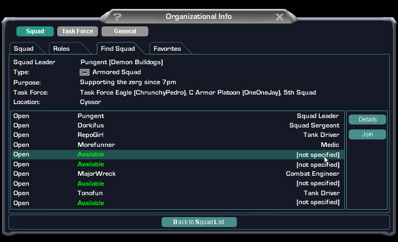
Compare that BF2 screenshot to these:   Much more useful. |
|||
|
|

|
|
|
[Ignore Me] #150 | |||
|
Colonel
|
But from what little experience I have with PS1's menus, I will still say that I'd like to see that particular function, along with the map(if both will fit) on a handy button like tab. I would also like to see the main map screen have BF2's click-order system. ie, you can bring up the map, right click a spot, and it will let you choose Attack/Defend/Move/etc. Except you should be able to click one spot and hit Move, click another and hit Move Waypoint etc, and it will create a chain of waypoints to follow to a destination. And these orders are not missions, by the way, they are simply micro-orders that you will use to help you complete a mission. |
|||
|
|

|
 |
|
|
| Bookmarks |


|
|