| Forums | Chat | News | Contact Us | Register |
PSU Social
|
 |
PSU: This is an example of an Accepted Quote
| Forums | Chat | News | Contact Us | Register |
PSU Social
|
 |
| Home | Forum | Chat | Wiki | Social | AGN | PS2 Stats |
|
|
|
||||||
 |
|
|
Thread Tools | Search this Thread | Display Modes |
|
|
[Ignore Me] #1 | ||
|
Private
|
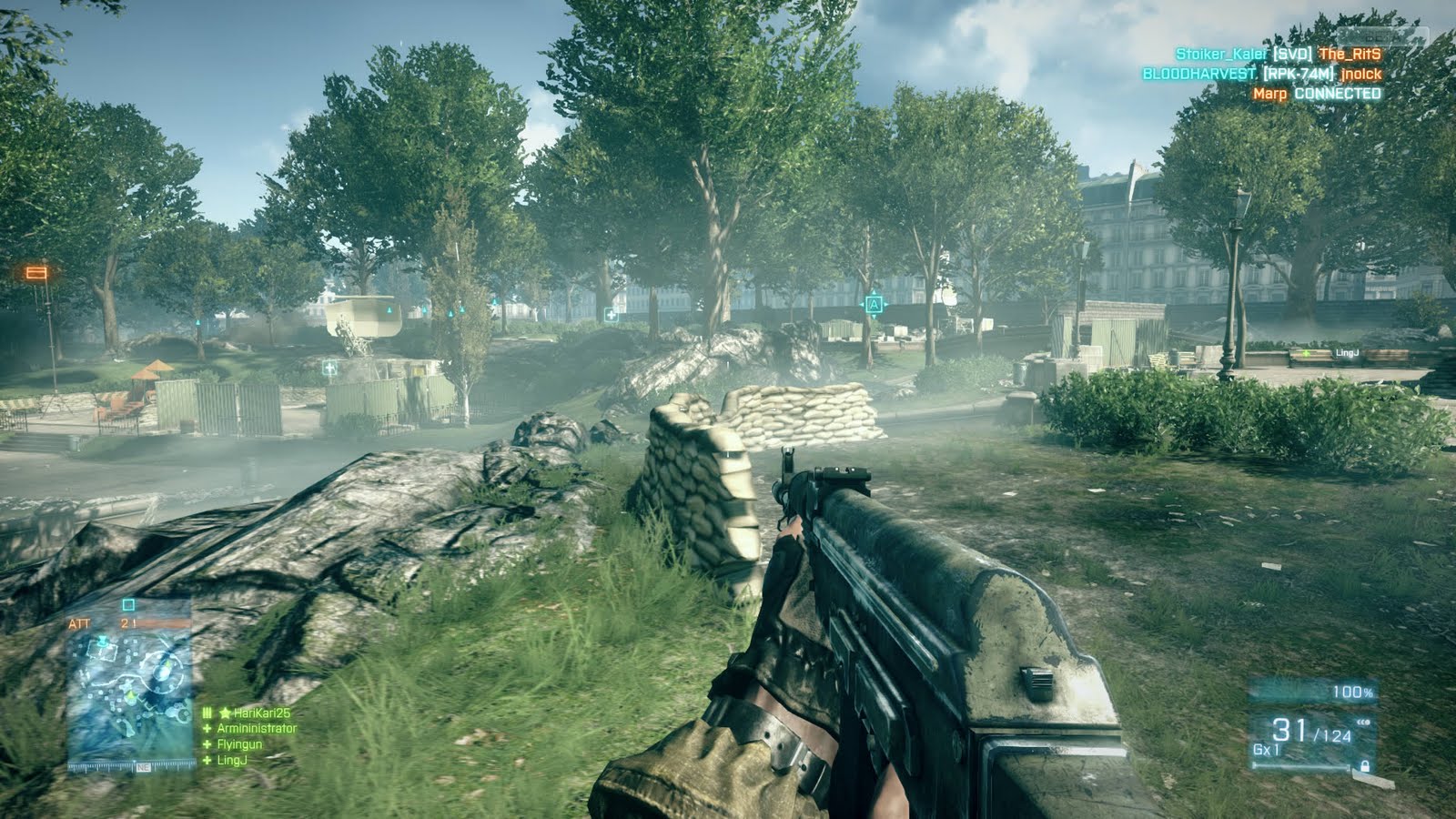
Just an issue with what I saw from the GDC Video:
The HUD, In my opinion needs to feel more like this  And Less Like this:  I wasn't really feeling the whole BF3/CoD style HUD and was missing the old HUD where you could see what was equipped where and all that. |
||
|
|

|
|
|
[Ignore Me] #2 | ||
|
Contributor Major
|
The fuck why? You want more shit cluttering up your screen and getting in your way? Why the fuck do I need a menu up all the fucking time? Why does it need to look more like Planetside 1, a game from 2000 BC in gaming years?
Seriously you people are such luddites sometimes. |
||
|
|

|
|
|
[Ignore Me] #7 | |||
|
Private
|
I'm not saying bring that HUD directly in from PS1, I'm just saying, I don't like the BF style for my beloved Planetside. |
|||
|
|

|
|
|
[Ignore Me] #8 | ||
|
First Lieutenant
|
I think people need to take a step back and realize that "The HUD is like Battlefield 3's" is not a good reason to change it.
If you feel the HUD is ineffective, then yes. Change it. But not because you're afraid of mainstream games. |
||
|
|

|
|
|
[Ignore Me] #9 | ||
|
Private
|
I'm more so picturing it like RedKnight mentioned. The ability to see the amount of ammo you had in all your guns, and the squad status bars up top were helpful. Maybe because of the loss of the free-form inventory this is the approach they had to go with?
|
||
|
|

|
|
|
[Ignore Me] #10 | ||
|
Private
|
I like some of the Hud aspects for the Infantry, weather it slightly changes depending on what class you play my change some opinions. I liked the old what of seeing you squad/ platoon HP, I don’t really see at this point or just really hard to see your HP/Armor bars or amount, I liked the old color full bars. Especially now that it seems we can’t heal/repair our self at all.
Other then all that I like the cleaner look, cannot say that about the hud when driving or flying, seem way to busy or distracting, eg when flying, do I really need to see such a huge distraction like that telling me what angle I am tilted at, I liked the old what say the lib used it was minimal and still did the same thing kinda. But one thing I really still hoping for Is the ability to customize my HUD be it running, driving or flying. To be able to adjust where they sit on my screen or the colors they are, eg less distracting HUD for flying by changing the color. What would be even better is like in some games and MMO's is the ability to totally customize the each hud look feel and what’s grouped together and such within a maximum allowable content that would be normally displayed. But how where size and what we want to display or not is up to us. |
||
|
|

|
|
|
[Ignore Me] #11 | ||
|
Lieutenant General
|
Well as a class you have a primary weapon, secondary (pistol all we know of for now) and a tool. Now since you know as a certain class you'll have certain "main" weapons will always be #1 slot, secondary is 2, etc. In PS1 most people I know did this anyway, their fav weapon would be #1 and an offhand or AV is #2.
I've seen a shot when he is switching weapons it shows what's equipped in each slot on the bottom right of his HUD. I also like less clutter. I always turned off the bottom right menu in PS1, and everything having a clear background till it's being used is just smart design. We still have ammo indicators, health bars, even an energy bar. We have kill updates, chat. The Squad Info and Implant indicators I wouldn't be surprised are missing, since we haven't had much (if any) info on those yet, and this is just a demo of mechanics. Any mechanics that are in we can't even judge by numbers, anything that can be measured by a number can be changed. |
||
|
|

|
|
|
[Ignore Me] #15 | |||
|
First Lieutenant
|
Don't blame mechanics that are perfectly fine when there are other, meatier issues to tackle that might result from this supposed copying of Battlefield 3. |
|||
|
|

|
 |
|
|
| Bookmarks |


|
|