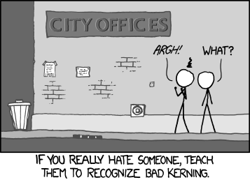
As mentioned in the title, I'm really just picking nits here. It's quite a small thing.
I'm a very detail-oriented person, as evidenced by my... corrections of people. This may have slipped under the noses of some people, so I thought I'd bring it to attention to be discussed (as if there's much to discuss), and hopefully have it looked at if time permits.
For those of you who don't know, kerning is a graphic-design term used to indicate the spaces between letters or characters.

I was taught to recognize kerning, and indeed it has bugged me for years.
I'm not very familiar with fonts, and I honestly don't know which one this forum uses, but there is a serious issue with the kerning.
If an example would help you, compare the spaces between the two letters in each exibit.
Exhibit 1: 'or' (Long spaces amidst)
Exhibit 2: 'tl' (Short, even spacing between the letters and apostrophes)
Anyways, it's just a silly thing to most people, but it does bug me :P Absolutely no rush on fixing this, if it needs to be fixed at all. Just noticing


