| Forums | Chat | News | Contact Us | Register |
PSU Social
|
 |
PSU: I'm Common Pool, thankyouverymuch.
| Forums | Chat | News | Contact Us | Register |
PSU Social
|
 |
| Home | Forum | Chat | Wiki | Social | AGN | PS2 Stats |
|
|
|
||||||
 |
|
|
Thread Tools | Search this Thread | Display Modes |
|
|
[Ignore Me] #1 | ||
|
PSU Admin
|
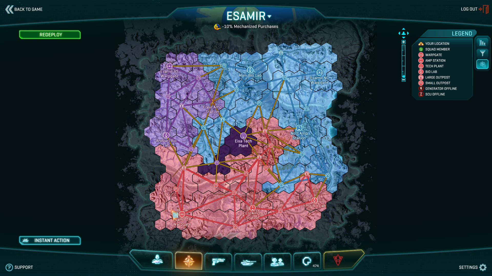
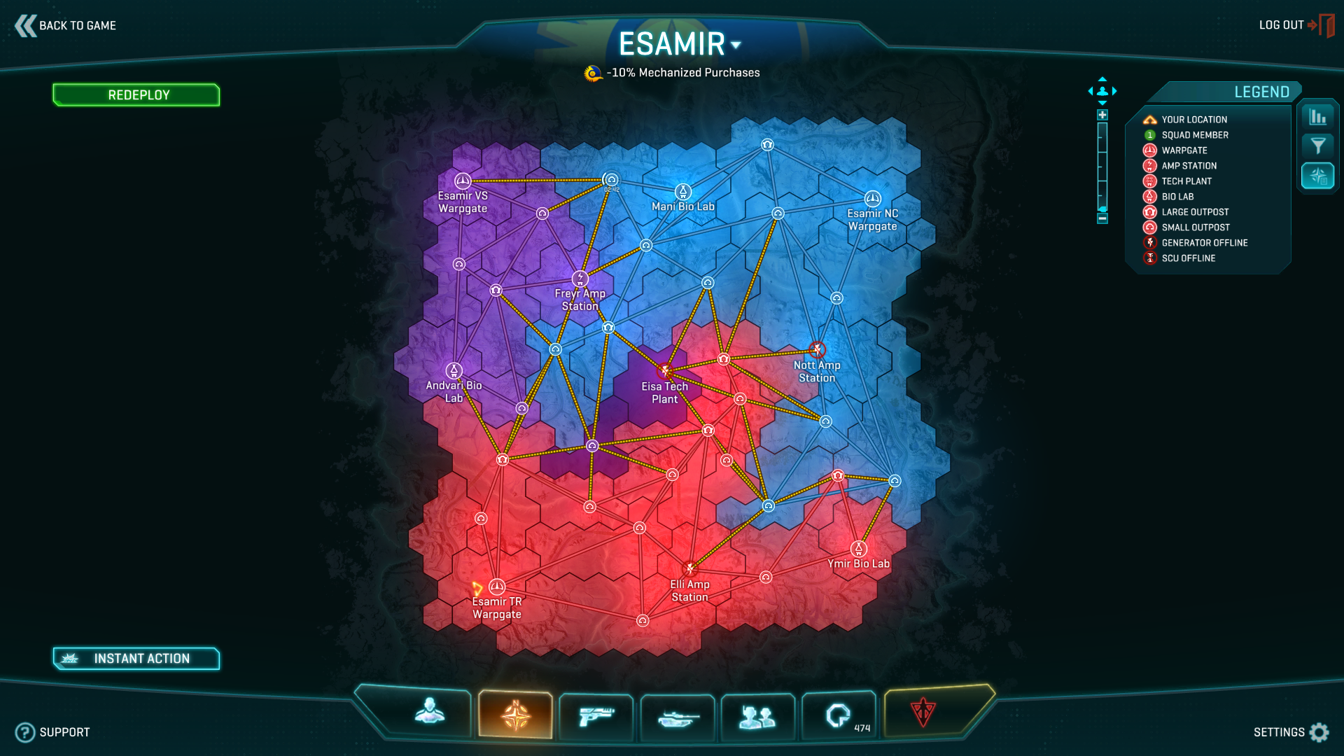
Early Lattice added to Esamir, new "Influence Cloud" option and the new Lattice Map.
 http://www.planetside-universe.com/media.php?view=2367  http://www.planetside-universe.com/media.php?view=2368  http://www.planetside-universe.com/media.php?view=2369  http://www.planetside-universe.com/media.php?view=2370 |
||
|
|

|
|
|
[Ignore Me] #2 | ||
No different than the current hex system, all the links are still there but they now have lines. They need to restrict movement options not just change the way it looks.
Is this some sort of fake lattice to see if people don't notice? |
|||
|
|

|
|
|
[Ignore Me] #3 | |||
|
Major
|
...It's just that they haven't remade Esamir for the Lattice yet. |
|||
|
|

|
|
|
[Ignore Me] #4 | |||
|
Second Lieutenant
|
Removing links would help reduce clutter too, so we'll see. |
|||
|
|

|
|
|
[Ignore Me] #5 | |||
Personally i don't think that the indar one is restrictive enough either, zergs will still hack around each of flattening anybody that bothers to try defending. |
||||
|
|

|
|
|
[Ignore Me] #7 | ||
|
Lieutenant Colonel
|
nothing actually functionally changed then. Why post this?
__________________
  Retired NC CR5, Cerberus Company. Not currently playing PS2. Anyone with a similar name is not me. My only characters are listed in my stats profile here on PSU. |
||
|
|

|
|
|
[Ignore Me] #8 | ||
|
Corporal
|
I honestly have mixed feeling about this, I hope the lattice system helps, but more than that I think low population factions need a major rethinking in alot areas
P.S. I don't know say which areas need rethinking simply because their are some many different things that could be improved upon. I am only pointing the observations, I see day to day on the TR. Last edited by HelpLuperza; 2013-05-17 at 12:16 AM. |
||
|
|

|
|
|
[Ignore Me] #9 | ||
|
Private
|
I have to admit that I approve of this. I even thought this would be better in the back of my mind despite how much I enjoyed the new visuals they were trying before. This system works best because even with the last version of the battle lanes, I could tell I would be a bit too subconsciously encouraged to follow those lanes and not let myself take more interesting routes. This really is just about the best of both worlds.
|
||
|
|

|
|
|
[Ignore Me] #10 | ||
|
Captain
|
I personally dont like it, for someone looking at this and they are a newer player it seems like this would still be confusing as to where to go compared to what it was before. With all the hexes touching and the rush lanes barely visible, it seems counter productive from a visual cue to put this in over the current system. As far as the gameplay goes, it works really well when I was on the test server for the few Play test we had. I just think this is going to confuse newbies a bit more then it current does.....but then again thats just my opinion.
|
||
|
|

|
|
|
[Ignore Me] #11 | ||
|
Major
|
New players can learn. Most of them probably don't even care about the meta until they learn the basics, and by then they'll have help who can explain it to them.
I understand the attitude of "L2P noob" has done a lot of games a hard hit, but it doesn't hurt the MOBA genre or the RTS genre. Now, this being an MMOFPS game, as in neither an RTS or MOBA, there has to be something to keep new players up-to-spec. However, PlanetSide 2's territorial meta is more equatable to STRATEGY GAMES, where "L2P noob" is completely valid and accepted. I vote we make the lattice/resource/meta as complicated and as hard to understand as we damn well need it to be. Shooting mechanics and the like are what need to be explained face-value. As is stands, PS2 is a ton more accessible to new players than MOBA or RTS games, especially if you have an experienced player as a guide. In LoL or SC2, you are absolutely fucked if you're up against a more experienced/more skilled player because it's either you, or you and four/two other guys. And no one has any time to pause and explain the game to you. Since in PS2, the battle never ends, it's alright to take a few moments to explain something to a newbie. The one irreversible problem with PS2 is that it throws everyone into the same game, pros and noobs all mashed together. I love it because of that. Last edited by AThreatToYou; 2013-05-17 at 01:13 AM. |
||
|
|

|
|
|
[Ignore Me] #12 | |||
|
Second Lieutenant
|
There's players who're good, there's players who are plainly aimbotting, and there's players who kill you with inhuman speed in close quarters. Hacks? I have honestly no idea. But I'm tired of dying to people like MamaYao on Waterson. Plays VS, every bullet hits almost perfectly, die almost instantly. Is it legit? I don't know. Will we find out if we report that player; will we get feedback about what's actually up with the people reported? NO. |
|||
|
|

|
|
|
[Ignore Me] #13 | ||
|
Sergeant Major
|
Cant realy judge the merits of the system based on Esamir since it hasnt been adapted yet. One thing is that i cant see the lines connecting bases belonging to one faction since they blend in with the hexes too much.
|
||
|
|

|
|
|
[Ignore Me] #14 | ||
|
Private
|
At first glimplse I don't understand anything and I don't want to. It seems hard.
Good that I play since begining so I know maps, if I would get that map as a new player I wouldn't want to read it. Too much lines, too much "clouds". Areas of influence should be in light colors, much more transparent, main battle flow should be in color as now it is. All those lines make chaos. It won't help, just confuse people. |
||
|
|

|
|
|
[Ignore Me] #15 | ||
well just from those pictures, the lattice still needs to stand out more and I don't think I like that overly bright halo/blur effect on the Hexs. Makes my eyes feel like I've been up all night at a smokey lock in at the pub. I do like the more vibrant colours but couldn't we get the same effect just without the blur/halo?
__________________
  "Don't matter who did what to who at this point. Fact is, we went to war, and now there ain't no going back. I mean shit, it's what war is, you know? Once you in it, you in it! If it's a lie, then we fight on that lie. But we gotta fight. " Slim Charles aka Tallman - The Wire BRTD Mumble Server powered by Gamercomms |
|||
|
|

|
 |
|
|
| Bookmarks |


|
|